10 Essential App Store Optimization Tips for 2026
From Code to Customers: ASO for Indie Devs
You shipped the SwiftUI app. RevenueCat is wired up. Firebase is logging events. The paywall looks clean, App Review passed, and now you're waiting for downloads that don't come.
That situation is common for indie teams because launch work and discovery work are different jobs. Building the product proves you can ship. App store optimization proves people can find it, understand it, and trust it enough to install. If you skip that second part, even a polished subscription app can sit in the store with almost no momentum.
ASO matters even more on iOS because search is where many installs start. Apple reports that 65% of App Store downloads come from keyword searches, which is why metadata and keyword work usually deserve attention before most other growth tasks in a lean launch plan, as summarized in OneSignal's ASO overview. For indie developers, that's good news. You usually can't outspend larger apps, but you can out-position them.
This guide stays focused on practical app store optimization tips for indie iOS developers building modern subscription apps with SwiftUI, RevenueCat, and tools like Spaceport. No generic “just improve your brand” advice. Just the levers that move visibility, conversion, ratings, and launch momentum.
Table of Contents
- 1. Optimize Your App Title and Subtitle for Keyword Visibility
- 2. Craft Compelling App Keywords 100 Characters Total
- 3. Develop High-Impact App Preview Videos and Screenshots
- 4. Build and Maintain a Strong App Rating and Review Strategy
- 5. Localize Your App Store Listing for International Markets
- 6. Implement a Comprehensive and Honest App Description
- 7. Leverage Social Proof, Testimonials, and Social Media Presence
- 8. Monitor Competitors and Adjust Your Strategy Quarterly
- 9. Optimize Pricing Strategy and Communicate Value in the App Store
- 10. Drive External Traffic and Pre-Launch Momentum to Boost App Store Ranking
- Top 10 ASO Tips Comparison
- Your ASO Is Never Done
1. Optimize Your App Title and Subtitle for Keyword Visibility
A developer ships a polished SwiftUI app, wires up RevenueCat correctly, gets the onboarding flow tight, and still sees weak App Store search traffic. The problem is often visible in the first line of the listing. The app name sounds clever, but it does not clearly say what the product does.
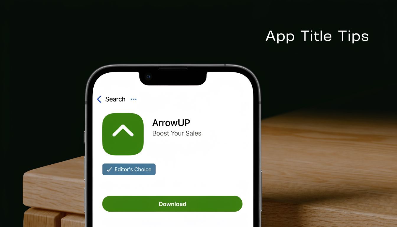
Your title and subtitle are metadata, but they also do product positioning. Apple uses them to understand relevance. Users use them to decide whether your app deserves a tap. If either side is confused, search visibility and conversion both suffer.
For indie iOS apps, clarity usually beats naming flair. A brand-only title can work after you already have demand from social, community, or press. Early on, plain language does more work. “Spaceport: SwiftUI App Builder” communicates category, audience, and use case in seconds. That matters more for a subscription app than it does for a one-time utility, because users want to know what they are paying for before they even hit the product page.
I usually treat the title as the home for the primary phrase and the subtitle as the qualifier. The title answers, “What is this?” The subtitle answers, “Why this one?” For a dev-focused app, a subtitle like “Build iOS apps with subscriptions” is stronger than a vague promise about speed or creativity because it matches how real buyers search and evaluate tools.
A few practical rules hold up well:
- Put the clearest searchable category term in the title. “SwiftUI builder,” “habit tracker,” or “invoice maker” beats a standalone brand name.
- Use the subtitle to sharpen buyer fit. Mention the outcome, audience, or monetization angle, such as subscriptions, paywalls, or faster prototyping.
- Cut filler words. “Smart,” “best,” “pro,” and “ultimate” usually waste space and say nothing specific.
- Match the language to the buyer. If you built the app for indie iOS developers, use terms those developers already use, including SwiftUI, paywalls, testing, or shipping.
- Stay accurate. If your app uses RevenueCat for subscriptions but does not include advanced analytics or A/B testing, do not hint that it does.
There is a trade-off here. Titles built for search can get stiff fast, and Apple does not give you much room. The goal is not to cram every term into visible metadata. The goal is to choose one clear primary phrase, keep the brand readable, and make the subtitle earn its place.
A good test is simple. If an indie developer scanning search results on iOS 26 can understand the app, the audience, and the paid value proposition in two seconds, the title and subtitle are doing their job.
2. Craft Compelling App Keywords 100 Characters Total
A lot of indie developers burn weeks improving onboarding, paywalls, and trial conversion, then treat the keyword field like leftover metadata. That misses one of the few App Store inputs you can still control precisely on iOS.
Apple gives you 100 characters in the keyword field, but the constraint is tighter than it looks because every slot has to earn installs. For a subscription app built with SwiftUI and sold to developers, broad words usually waste space. Terms like “app,” “productivity,” or “tools” pull in traffic with weak intent. Specific terms tied to the problem you solve do better.
Choose terms that match how your buyer searches
For developer-focused apps, keyword selection is product positioning in compressed form. Use the words an indie iOS developer would type when evaluating a tool: “swiftui,” “paywall,” “subscriptions,” “prototyping,” “revenuecat,” “ios builder.” Those terms signal both context and purchase intent.
This matters even more for subscription apps. If the paid value is recurring revenue support, testing paywalls, or shipping faster on iOS 26, your keywords should reflect that job clearly. A Spaceport-style product should sound like a tool a developer would search for, not a generic creator app trying to rank everywhere.
Build the set like a constraint problem
Good keyword sets are tight. Remove duplicates that already appear in the title or subtitle, since Apple can combine metadata fields. Skip plurals, filler, and category words you have no chance of ranking for.
I usually filter terms with three questions:
- Would my target user search this on the App Store?
- Does the app clearly satisfy that term after install?
- Can an indie app realistically compete for it?
If the answer is no to any of those, cut it.
Common mistakes that lower relevance
The pattern is predictable:
- Chasing volume over fit. High-impression keywords often bring low-conversion traffic.
- Adding trendy terms the product does not support. If the app is not an AI tool or no-code builder, do not imply that it is.
- Ignoring subscription-specific intent. “Paywall,” “trial,” and “subscriptions” can be more useful than generic builder terms for apps monetized through RevenueCat.
- Leaving the field untouched for months. Keyword strategy should change when your feature set, audience, or monetization focus changes.
One practical trade-off is discoverability versus conversion quality. Ranking for a wider term can increase impressions, but it can also flood your page with the wrong audience. For indie developers, that usually means weaker conversion, noisier review sentiment, and less useful signal when you try to measure what changed.
The best keyword set does not describe everything your app can do. It describes the reasons the right buyer would search for it.
A simple pass works well. Start with 15 to 20 candidate terms from App Store search suggestions, competitor listings, and your own onboarding language. Cut anything vague. Cut anything unsupported. Then keep the terms that best match your actual paid use case, especially if your app helps developers ship, test, or monetize iOS apps faster.
3. Develop High-Impact App Preview Videos and Screenshots
A developer ships a solid SwiftUI app, wires up RevenueCat correctly, gets search impressions, and still watches installs stall on the product page. That usually points to creative, not code. Screenshots and preview video do the conversion work after the tap.
Treat these assets like part of the funnel. They need the same iteration discipline you apply to onboarding, paywalls, and pricing tests. For indie iOS apps, especially subscription products, the goal is simple. Show what the app does, who it is for, and why the paid experience is worth starting.
Make the first three screenshots carry the page
Search traffic is impatient. Many visitors decide based on the first few frames, so weak opening screenshots waste the traffic your title and keywords earned.
A structure that works well for developer tools, utilities, and subscription apps looks like this:
- Screenshot one: Lead with the outcome. Name the job the app helps users finish.
- Screenshot two: Show the core interaction in the actual interface.
- Screenshot three: Show the reason to choose this app over the next result in search.
For a modern indie app, that means showing real product value fast. If the app helps developers ship faster, show a real SwiftUI workflow. If it handles subscriptions through RevenueCat, show the paywall and the paid state clearly. If iOS 26 support matters, show UI that looks current and compliant instead of recycling old captures from a previous design system.
Do not open with a settings screen, account form, or analytics dashboard unless that is the product's main value. Lead with the result.
Here's a useful example of how preview storytelling works in motion:
Show the app in use, with real flow and real stakes
Preview video should answer the questions a cautious buyer already has. What happens first? What does the app look like on device? What do I get after I subscribe?
That matters more for subscription apps than for one-time purchase utilities. If users suspect the paywall appears too early, hides pricing, or blocks the core value, conversion drops. Showing the onboarding path, paywall presentation, restore path, and post-purchase experience can filter out the wrong traffic and improve install quality.
I usually prefer a plain, product-led sequence over polished brand animation:
- Start with the first meaningful action.
- Show one complete happy path.
- Include the paywall only in context.
- End on the paid outcome, not the purchase screen.
That trade-off matters. A more cinematic video can look better, but a direct product demo usually converts better for indie software because it reduces ambiguity.
Keep the creative system consistent
Screenshot sets often underperform because they were assembled over months of feature launches. Fonts change. Device frames change. Messaging shifts from user outcome to feature jargon. The page starts to feel stitched together.
Consistency fixes that. Use one visual style, one headline pattern, and one promise throughout the set. If your app targets indie developers, say that plainly. If Spaceport helps generate production-ready app scaffolding faster, show that workflow in the same visual language from screenshot one through the last frame.
Good ASO creative is specific. It shows the product operating in a believable iPhone context, with current UI, readable text, and a clear paid use case. That is what gets the right user from curiosity to install.
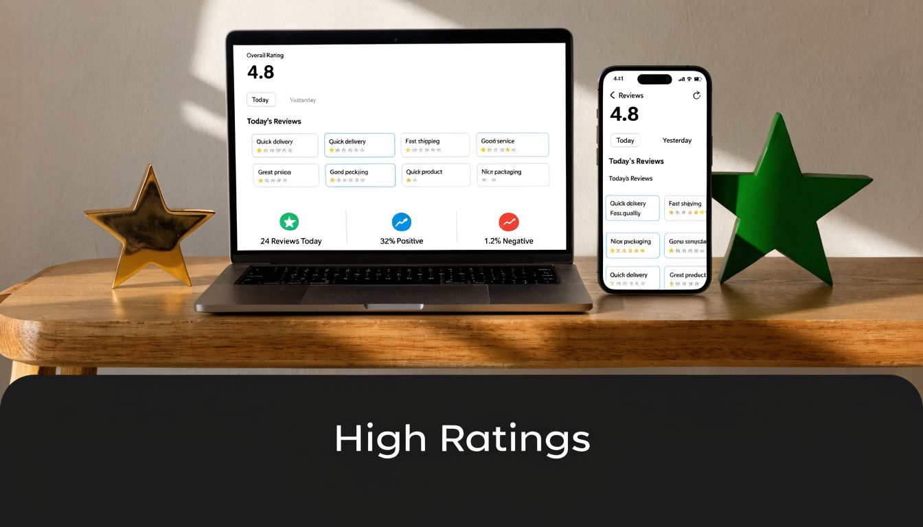
4. Build and Maintain a Strong App Rating and Review Strategy
You ship an update, installs hold steady, then conversion slips. The screenshots are fine. The keywords are fine. The problem is the first thing many buyers notice on your product page: a 3.8 rating and a fresh run of reviews complaining about billing confusion, restore failures, and crashes after the iOS update.
That pattern is common in indie subscription apps. Ratings shape trust before a user ever taps Get, and they often reflect product discipline more than marketing skill. For a SwiftUI app with RevenueCat, review strategy starts with the subscription flow, support flow, and release quality.
Protect the rating at the source
A weak rating usually comes from a few predictable failures. The app crashes on launch. The paywall appears before the user understands the value. Trial terms feel vague. Restore purchases fails on a second device. Support is hard to find, so frustration goes straight into a public review.
Fix those paths first.
For modern indie iOS apps, that usually means checking four areas every release cycle:
- Release stability: Test startup, account state changes, purchase, restore, and background resume on current iOS 26 devices.
- Subscription clarity: Show price, billing period, and trial terms in plain language. Do not make users hunt for them.
- Entitlement accuracy: Make sure RevenueCat entitlements update correctly after purchase, restore, refund, and account switching.
- Fast support access: Put Help or Contact inside settings and near the paywall if billing issues are common.
If you use Spaceport or other code generation tools to move faster, treat generated subscription and onboarding code as a starting point, not a trust guarantee. The generated flow can save time. It still needs real device testing, App Review edge-case checks, and verification against your actual RevenueCat configuration.
Ask after value is proven
The review prompt should follow a success event the user clearly recognizes. In a developer tool, that might be generating a project, exporting assets, shipping a build, or successfully restoring premium access on a new device. In a consumer subscription app, it may be after the third completed session, not the first launch.
Timing matters because the iOS prompt is limited and easy to waste. Asking too early burns one of your best chances on a user who has not seen the product work yet.
A practical rule is simple: trigger the prompt after the user gets the outcome they paid for, or after a free user reaches a meaningful win that predicts retention.
Route frustration away from the App Store
Happy users rarely wake up wanting to leave a review. Angry users do.
That trade-off changes how support should work inside the app. If someone hits a purchase error, sync issue, or export failure, the next step should be a help action, not a dead end. Give users a clear way to email support, report a bug, or restore access before they leave the app. For a solo developer, even a plain support form and a reliable response pattern can protect your rating better than asking more often.
Run reviews like part of QA
Review strategy is ongoing product work. After every release, check Crashlytics, subscription events, and recent review text together. Look for clusters. If three users mention being charged unexpectedly, the problem may be your paywall copy. If reviews mention premium not activating, inspect entitlement sync before changing the prompt timing.
I treat ratings as a lagging indicator of app quality. They improve when the product is stable, the subscription logic is clear, and support is easy to reach. Then the review prompt starts working the way developers hope it will.
5. Localize Your App Store Listing for International Markets
You ship a solid iPhone app, the US listing converts well enough, and then installs from Germany, Japan, or Brazil start showing up in App Store Connect. Many indie developers stop at translated metadata. That leaves real growth on the table.
Localization changes how your app is discovered and how safe it feels to download. Search terms differ by market. Screenshot reading patterns differ too. Subscription language matters even more. If your paywall promises a free trial, annual plan, or restore flow, that wording has to feel native and precise in every market you target.
For indie iOS apps, especially subscription products built with SwiftUI and RevenueCat, sloppy localization creates two problems at once. You lose search visibility, and you create doubt right before install or purchase. I see this a lot with developer tools and utility apps. The product is good, but the listing still reads like it was pushed through a translation layer without anyone checking how local users describe the job they need done.
Translate the user's intent
Localize around the problem language your audience uses in that country. Internal product terms are a bad source of truth.
Words like “builder,” “generator,” “template,” “tracker,” and even “subscription” do not carry the same meaning everywhere. If your app helps developers ship faster with SwiftUI, users may search for “boilerplate,” “starter,” “app template,” or a local equivalent that maps better to workflow than brand positioning. The right term depends on the market.
This matters even more for niche apps. A meditation app can get away with broader category language. A dev-focused app, SaaS companion, or subscription utility usually cannot.
Localize screenshots like product marketing, not UI chrome
Screenshot copy should be rewritten, not mechanically translated. Short English phrases often expand in German, compress in Japanese, and become awkward if you force the same layout everywhere.
Keep the structure simple:
- Use local search terms in the title, subtitle, and keyword field where they fit naturally.
- Rewrite screenshot captions so they sound native and still fit the design.
- Adjust the value proposition by market. One region may respond to speed, another to privacy, another to price clarity.
- Check subscription wording for trial terms, billing cadence, and restore access language.
- Review visual density so the creative matches what users in that store commonly expect.
If you use a workflow tool like Spaceport to generate assets or ship listing updates faster, treat localization as a product release, not a copy task. Export the localized screenshots, test line breaks on device-sized frames, and check whether the first two images still communicate the core benefit without relying on English context.
Start small and finish properly
Do not spread a tiny budget across ten storefronts.
Pick two or three markets where you already see impressions, where support is realistic, and where your app's category language is clear. Then localize the full listing. Metadata, screenshots, subscription terms, and support touchpoints should all match. Partial localization usually looks cheaper than no localization because it signals that the app may not fully support the market.
For subscription apps, I also check one extra thing before rolling out a locale. Make sure the onboarding, paywall, and restore purchases flow stay consistent with the listing promise. If the App Store page says one thing and the in-app purchase experience says another, conversion drops and refunds rise.
6. Implement a Comprehensive and Honest App Description
On iOS, the description isn't where you win keyword indexing. It's where you close the install for users who need one more layer of confidence.
That changes how you should write it. Don't treat the description like a feature dump. Treat it like a product pitch for someone who already landed on the page and wants to know whether your app is worth the tap, the time, and the subscription.

Write the first lines like product positioning
The first lines should answer three questions fast. What is this? Who is it for? Why is it better than the obvious alternative?
For a Spaceport-style product, “Ship production-ready iOS apps in days with SwiftUI, subscriptions, auth, and analytics prewired” is stronger than “A modern app builder for creators.” One sounds like an outcome. The other sounds like a category label.
A good description usually moves in this order:
- Problem: Why building this kind of app is painful.
- Solution: What your app does.
- Benefits: Faster launch, fewer integration mistakes, cleaner architecture.
- Feature proof: RevenueCat, Firebase, auth, iOS 26 readiness, AI layers.
- Audience fit: Indie devs, studios, founders validating subscription apps.
Don't hide the business model
If your app includes subscriptions, trials, or paid features, say so clearly. A vague description may get an install, but it also creates the kind of surprise that leads to bad reviews and refund requests.
For indie apps, honesty usually converts better than polished ambiguity. If you charge once and include lifetime updates, that's a selling point. If you're subscription-first, explain what the user gets and why ongoing pricing makes sense. People don't mind paying for value. They mind feeling tricked.
Clear product copy beats persuasive product copy when the user already has purchase anxiety.
7. Leverage Social Proof, Testimonials, and Social Media Presence
A developer finds your app after searching for a SwiftUI subscription template, taps into the listing, likes the screenshots, then leaves to verify that the product is real. That second check happens all the time, especially for indie iOS tools that promise RevenueCat support, iOS 26 readiness, or faster launch paths. If your public footprint looks thin, trust drops fast.
Social proof should answer the doubt that blocks the install. For a consumer app, that may be ratings volume or a recognizable publication. For a developer-focused app, proof usually needs to be more concrete. Show shipped apps, implementation results, and feedback from people with relevant roles. A quote from an indie founder who shipped a subscription app in SwiftUI is stronger than a generic compliment about the interface.
Use proof that matches the buyer
Match the evidence to the audience you want. If you sell to indie iOS developers, use testimonials from indie iOS developers. If your app helps teams ship subscription products, show proof tied to paywalls, onboarding, retention, or release speed.
For Spaceport-style products, the best proof is often visible output. Public app examples, founder case studies, and partner work do more than polished homepage copy because they let skeptical builders inspect the result for themselves. Spaceport's partner examples and ecosystem page shows the kind of evidence that helps a developer verify that the product fits a real workflow.
Treat social presence as proof of maintenance
Social media matters less as audience building and more as a maintenance signal. An active X account, changelog, GitHub activity, or build-in-public thread tells potential users the app is alive. That matters for subscription apps. People are less willing to start a trial if they suspect the product will be abandoned after one release cycle.
Useful trust builders include:
- Named testimonials: Real name, real role, specific outcome
- Project showcases: Apps shipped with your stack or template
- Build updates: Feature releases, bug fixes, iOS compatibility work
- Developer channels: GitHub, X, Discord, Indie Hackers, Product Hunt
- Educational content: Short posts that explain implementation decisions, like the developer articles on the Spaceport blog
If you do not have press coverage, do not pad the page with vague authority signals. Show the proof you have. For modern indie apps, a credible testimonial, a shipped example, and a visible record of ongoing updates usually do more for conversion than broad social hype.
8. Monitor Competitors and Adjust Your Strategy Quarterly
A quarter passes fast on the App Store. A competitor ships a SwiftUI redesign, changes its subtitle, adds a weekly plan, and suddenly your listing is competing against a different pitch than it was three months ago.
For indie iOS developers, this review matters because you usually do not win by outspending larger apps. You win by being clearer. For a subscription app, that often means spotting weak framing around trials, paywall expectations, onboarding friction, or who the product is intended for.
Watch what changed, not just who ranks above you
Rank is the lagging signal. Positioning changes show up first.
Review competitor listings like a builder, not a casual shopper. Check the title and subtitle. Compare the first two screenshots. Read recent reviews for complaints about pricing, bugs, or feature gaps. If you ship with RevenueCat, pay attention to whether competing apps explain subscriptions well or still create the usual uncertainty around billing and trial terms. That gap is often easier to exploit than a pure keyword gap.
For modern iOS apps, I would track these items every quarter:
- Metadata shifts: New keyword themes, dropped terms, tighter category language
- Screenshot strategy: Whether they show real product UI, polished marketing panels, or feature density
- Subscription framing: How clearly they explain free trial terms, premium access, and ongoing value
- Review patterns: Repeated complaints that point to weak trust, poor onboarding, or pricing confusion
- Platform credibility: Signs they are current on iOS 26 expectations, widget support, privacy details, or StoreKit-related polish
Turn competitor review into a small operating habit
This does not need a spreadsheet empire.
Use a simple quarterly doc. Save screenshots. Paste the current title, subtitle, and opening review themes for the top apps in your niche. Then make only two or three changes on your side. More than that and you will not know what improved conversion.
I have seen this work well for builder-focused products. If every competing app sounds broad and vague, commit to a sharper promise such as SwiftUI-native setup, RevenueCat-ready subscriptions, or faster launch for indie teams. If their screenshots hide the actual interface, show the interface. If they talk like a consumer wellness app while selling a developer tool, fix the mismatch and make the audience obvious.
For examples of how developer-first products refine messaging over time, the Spaceport developer blog is a useful reference.
Copying a competitor usually produces a weaker version of their strategy. Finding the part they ignored is where the gain usually is.
9. Optimize Pricing Strategy and Communicate Value in the App Store
Pricing affects conversion before the user ever experiences your product. If the value isn't clear, even strong screenshots and metadata won't save the install.
Subscription apps need especially sharp communication here. The App Store user has seen too many vague paywalls, too many “free” installs that turn into surprise billing, and too many tools that hide the actual plan until after onboarding. If your listing creates that same feeling, trust drops fast.
Pricing changes conversion before onboarding starts
Custom Product Pages can help you align the store experience with the traffic source. A Digital Applied summary reports that iOS Custom Product Pages deliver an 18% to 26% conversion lift over default pages when paired with paid campaigns, and that teams commonly use multiple variants to match messaging to audience segments, according to Digital Applied's CPP statistics roundup. For subscription apps, that's useful because “free trial,” “freemium,” and “direct paid” users often need different framing.
If you're running Apple Search Ads or any paid campaign, tailor the page to the intent. A user searching for a developer tool may want to see setup speed and architecture. A user searching for a subscription app template may care more about paywalls, pricing control, and RevenueCat integration.
Match pricing to your app category
Your app store page should make the value obvious before the install. That doesn't mean listing every billing detail in giant text. It means reducing ambiguity.
Use a simple internal test:
- Would a user understand what's free?
- Would they understand what grants access to paid features?
- Would they feel misled after install?
For a one-time purchase, emphasize ownership and lifetime updates. For subscriptions, explain what ongoing work the subscription supports. For indie developers, pricing friction often comes less from price itself and more from uncertainty about what's included.
10. Drive External Traffic and Pre-Launch Momentum to Boost App Store Ranking
You ship the build, submit for review, post once on X, and wait. A week later, the app is live, the page is fine, and installs barely move.
That pattern is common with indie launches because App Store visibility usually follows attention. Apple is more likely to surface an app that gets a real burst of qualified installs than one that appears without fanfare and hopes search traffic will catch up later. For a SwiftUI app with subscriptions, launch week is not just a marketing event. It is the first ranking test, the first retention test, and the first paywall test at the same time.
Bring the right traffic first
The goal is not raw clicks. The goal is traffic that already understands the problem your app solves.
For an indie iOS developer tool, that usually means developers who have already seen the product in context. Show the generated UI. Show how the app handles iOS 26 requirements. Show RevenueCat-backed subscriptions working in a real build, not a mockup. If you need a good benchmark for what that proof looks like, Spaceport's gallery of shipped app examples is useful because it shows finished outputs instead of marketing promises.
Cold traffic is expensive. Warm traffic converts.
Build pre-launch proof, not just pre-launch buzz
Start before the App Store page matters. Post build logs, short feature clips, TestFlight notes, and changelog screenshots. Share the trade-offs too. If onboarding took three iterations to get right, say that. If subscription copy changed after RevenueCat data showed weak trial starts, show the revision. Developer audiences respond better to evidence than hype.
This matters even more for subscription apps. People are slower to install if they expect a paywall and cannot tell what the paid tier does. Pre-launch content should answer that before they ever hit the product page.
Use a launch sequence with follow-through
One post rarely does enough. Run a sequence with a job for each phase:
- Before launch: Collect interested users from X, Indie Hackers, newsletters, Slack groups, Discord communities, and your TestFlight list.
- At launch: Send people to the store with your clearest demo and one specific reason to install now.
- After launch: Publish fixes, ship small updates, answer reviews, and repost user outcomes.
I have seen small apps get better results from ten clear posts over two weeks than from one polished launch thread. Repetition works if each update adds proof.
Match the channel to the app
Product Hunt can help if your app is broad and easy to grasp in one screenshot. It is less reliable for niche developer tools. Developer communities often send less traffic, but the traffic is better. Email lists are slower to build, but they give you a launch asset you control. TestFlight users are usually your best early reviewers if the app is stable enough to ask.
Treat each channel differently. A SwiftUI builder pitch, a consumer habit tracker pitch, and a B2B subscription utility pitch should not use the same message.
For indie teams, that is the primary advantage of pre-launch momentum. It gives the App Store a reason to notice the app, and it gives you early feedback from the exact users you want to keep.
Top 10 ASO Tips Comparison
For an indie iOS app, these ten tactics do not carry the same weight at every stage. A SwiftUI side project with a weak first screenshot has a different bottleneck than a subscription app with strong conversion but poor keyword coverage. Use the table to decide what to fix first, based on effort, expected upside, and the kind of app you are shipping.
| Strategy | Complexity 🔄 | Resources ⚡ | Expected Impact 📊 | Ideal Use Cases 💡 | Key Advantage ⭐ |
|---|---|---|---|---|---|
| Optimize App Title & Subtitle for Keywords | Low 🔄, fast metadata edits, subject to review timing | Low ⚡, copywriting and keyword research | Medium 📊, improves search visibility quickly | New listings, stalled keyword rankings, early ASO passes | High ROI and direct control over discoverability ⭐ |
| Craft Compelling App Keywords (100 chars) | Medium 🔄, careful selection and ongoing pruning | Low ⚡, research tools and repeat testing | Medium-High 📊, better ranking for niche intent | Indie apps targeting specific workflows, pain points, or subscription use cases | Strong long-tail targeting without heavy production work ⭐ |
| Develop High-Impact Preview Videos & Screenshots | High 🔄, production, iteration, and localization | High ⚡, design tools, editing time, or contractors | High 📊, strong conversion gains when the product needs a visual explanation | Apps built in SwiftUI, utility apps, and products with visible before-and-after value | Shows the product fast and reduces install hesitation ⭐ |
| Build & Maintain Ratings and Review Strategy | Medium 🔄, prompt timing, support loops, and monitoring | Medium ⚡, analytics, support time, and crash tracking | Very High 📊, affects both conversion and ranking | Subscription apps, launch windows, and apps recovering from bug-related review drops | Turns product quality into trust users can see ⭐ |
| Localize App Store Listing for Intl Markets | High 🔄, translation plus cultural adaptation | High ⚡, translators and localized creative assets | High 📊, opens new search demand and conversion upside | Apps with traction outside English-speaking markets or clear demand in specific regions | Reaches less crowded segments with tailored messaging ⭐ |
| Implement a Detailed, Honest Description | Medium 🔄, writing and structuring for different buyer intents | Low-Med ⚡, copywriting and testing | Medium 📊, helps qualified users understand fit before install | Apps with multiple features, subscription tiers, or technical audiences | Clarifies what the app does and filters out poor-fit installs ⭐ |
| Use Social Proof & Testimonials | Medium 🔄, gather, format, and refresh proof points | Medium ⚡, screenshots, outreach, and brand assets | Medium-High 📊, improves credibility and conversion | Early-stage apps, niche tools, and products with strong user outcomes | External validation helps hesitant users commit ⭐ |
| Monitor Competitors & Adjust Quarterly | Medium 🔄, recurring analysis and prioritization | Medium-High ⚡, ASO tools and review time | Medium 📊, reveals gaps in positioning, keywords, and creative | Busy categories, copycat markets, and apps competing against better-funded teams | Keeps your listing current and sharper than static competitors ⭐ |
| Optimize Pricing Strategy & Communicate Value | Medium 🔄, testing plus clear paywall and listing alignment | Medium ⚡, analytics, pricing research, and subscription data | High 📊, affects revenue, conversion, and refund risk | RevenueCat-based subscription apps, freemium products, and paid utilities | Connects pricing to perceived value before the install ⭐ |
| Drive External Traffic & Pre-Launch Momentum | High 🔄, multi-channel planning and execution | High ⚡, community outreach, content, PR, and paid acquisition | Very High 📊, strongest during launch and major updates | New launches, feature releases, and apps using Spaceport or waitlists to build demand | Creates early velocity that can improve store visibility ⭐ |
The trade-off is simple. Metadata is faster to change. Creative assets and pricing usually take longer, but they often move conversion more. For indie developers, the best sequence is usually title and keywords first, screenshots second, then reviews, pricing, and localization once the app has stable retention and a clear subscription story.
Your ASO Is Never Done
App store optimization isn't a setup task you finish once and forget. It behaves more like product work. You make a change, watch what happens, keep what improves results, and replace what doesn't.
That's why the best app store optimization tips are usually not flashy. They're disciplined. Choose a title that people search for. Build a keyword set around real intent. Put your strongest screenshots first. Ask for reviews after value is delivered. Localize where your app has a real chance to resonate. Keep your description honest. Show proof. Study competitors. Explain pricing clearly. Bring traffic on purpose instead of hoping the store will discover you.
For indie iOS developers, the playing field is often more balanced than expected. You probably won't outspend category leaders. You probably won't beat them on raw brand demand either. But you can be clearer, faster, and more specific. You can ship updates more often. You can tailor your visuals to a narrower audience. You can build around long-tail intent they ignore. You can create a product page that feels like it was made for one exact user instead of everyone.
That matters because ASO sits between every growth motion you have. Organic search depends on it. Paid traffic depends on it. Social traffic depends on it. Even word-of-mouth depends on it, because referrals still land on the same App Store page. If that page doesn't explain the product well, the traffic doesn't convert. If the metadata is weak, the app won't show up enough to get the chance.
The best way to improve is to narrow your focus. Pick one or two levers this week and work them properly. Rewrite your title and subtitle. Refresh your first three screenshots. Clean up your review prompt timing. Localize one market. Tighten the first lines of your description. Don't try to overhaul everything at once and then guess what worked.
A strong app doesn't automatically become a discovered app. But a strong app paired with consistent ASO work has a much better shot at becoming a sustainable one. That's the primary goal. Not a launch spike you can't repeat, but a listing that keeps getting sharper as the product gets better.
Spaceport helps indie iOS teams do the part most app builders skip. It generates production-ready SwiftUI apps with onboarding, paywalls, RevenueCat, auth, Firebase, typed networking, and iOS 26-ready structure already in place, so you can spend more time improving conversion and less time wiring basics together. If you want to ship paid apps faster and give your ASO a stronger product to sell, take a look at Spaceport.